The emergence of white post-Labor day in fashion proves that colors are not boxed in by the seasons to which they are related. White is not the only exception, however. The use of pastels for interior design, and fashion, year-round has become extremely popular.
In fact, one of Fall 2014’s fashion and design trends is the use of pastels. These soft, cheery colors are SPRINGing up in home design and clothing stores, alike.
Pastels can be used to both create a retro feel, or to complement a sleek, modern look. Their versatility extends further, and as doses of these delicate hues pair nicely with both neutrals and bright colors. For this reason, pastels can be used in any situation, alongside any color.
Whether you’re decorating with these bright hues from floor to ceiling, or just allowing these flowery pastels to spring up as accents, adding artwork with pastel tones can make any space bloom.
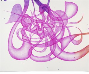
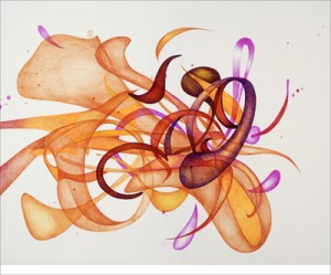
Artists, such as Valérie Francoise, Samuel Levy, Mark Rothko, and Paul Klee have captured the essence of the months March, April, and May, using the pastels that characterize the Spring season to create a lasting feeling of fresh, new life.
These pastel tones will remind you of a time when the grass really is greener. So, when it comes to you Summer to Fall design transition, I’d recommend no Spring cleaning.
Instead, keep your pastels out of storage boxes and in your homes. These soft, fresh colors will bring the warmth of Spring into your space long after times of April showers and May flowers.